

理解响应式图片:从像素到DPR
关于像素
Pixel
- Physical Pixel: 屏幕上一个最小的发光单元
- CSS Pixel: 物理测量单位。1 像素等于 1/96 inch
1 inch = 2.54 centimeters,描述屏幕尺寸时,12.9 inch 意思是屏幕对角线长度为 12.9 inch,即 32.766 cm
Resolution & Pixel Density
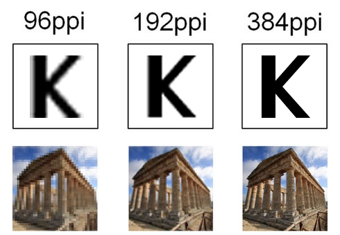
- Resolution 分辨率: 描述一块屏幕/图片横纵各 Pixel 数量,单位 px(pixel)
- Pixel Density 像素密度:描述显示器清晰度的规则,一般以 PPI 为单位,Pixels Per Inch,即显示设备上每英寸含有多少个物理像素
以 iPad 12.9-inch 为例,分辨率为 2048x2732,可以计算出 PPI 为
相同尺寸下,通过减少像素之间的距离(也就是更多的物理像素),可以提高显示效果。偶尔也可以在购物网站上看到这个参数——Pixel Pitch,即显示屏上两个相邻像素的之间的距离
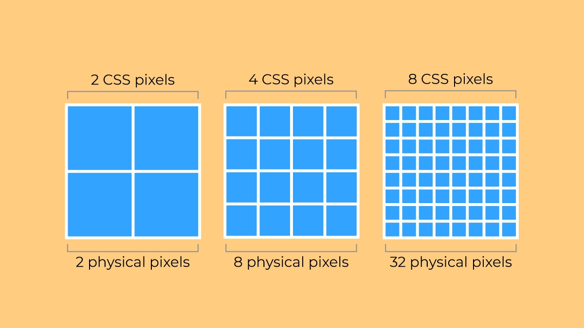
Device Pixel Ratio (DPR)
大多数产品的像素密度是 96 PPI,可以得到:
但随着移动端设备的发展,出现了高像素密度的显示屏,设备物理像素不再与 CSS 像素相同,前面提到的 iPad Pro-12.9 Inch 就是一个例子。它的
因此引入了devicePixelRatio这一概念,它将设备物理像素和 CSS 像素联系起来,如此,在 CSS 里设置像素值时就不用考虑设备的差异了。
Device Pixel Ratio - Oxyplug中列举了常见的设备的 DPR:
| Name | Phys. width and height | CSS width and height | Pixel ratio |
|---|---|---|---|
| Apple iPhone 16 Pro Max | 440 x 956 | 1320 x 2868 | 3 |
| Apple iPhone 7, iPhone 8 | 750×1334 | 375×667 | 2 |
| Apple iPhone 6+, 6S+, 7+, 8+ | 1080×1920 | 414×736 | 3 |
| Apple iPod Touch | 640×1136 | 320×568 | 2 |
| Samsung S24 | 1080 x 2340 | 360 x 780 | 3 |
| Samsung Galaxy S8+ | 1440×2960 | 360×740 | 4 |
| Samsung Galaxy S7, S7 edge | 1440×2560 | 360×640 | 4 |
| Motorola Nexus 6 | 1440×2560 | 412×690 | 3.5 |
| Sony Xperia Z3 | 1080×1920 | 360×598 | 3 |
| Xiaomi Redmi Note 8T | 1080×2340 | 393×775 | 2.75 |
| Xiaomi Redmi Note 5, 6 | 1080×2160 | 393×739 | 2.75 |
| Blackberry Leap | 720×1280 | 390×695 | 2 |
你可以在 DevTools 的 console 中打印 window.devicePixelRatio 查看当前设备的 DPR:
Responsive Image
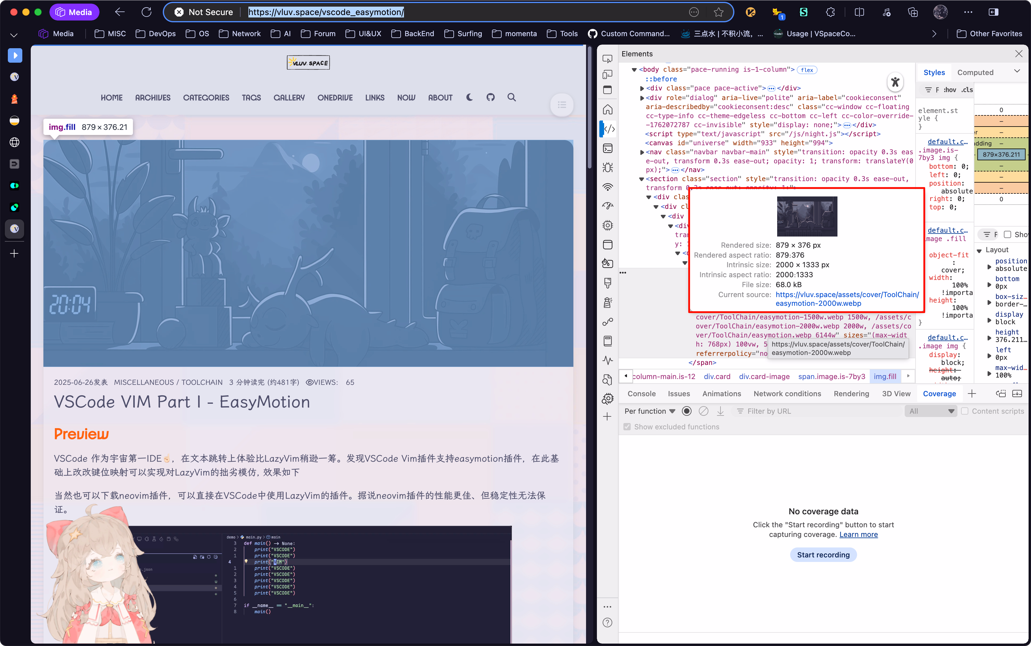
Rendered Size & Intrinsic Size
在 DevTools 中可以看到图片的两个重要尺寸:Rendered Size 和 Intrinsic Size
- Rendered Size:表示图片文件的大小,这里以 CSS px 为单位,例如
879x500表示图片在浏览器中显示时宽 879 个 CSS px,高 500 个 CSS px - Intrinsic Size:表示图像文件自身的像素尺寸,单位为图像像素(Image Pixel),例如
2048x1000表示图片宽有 2048 个像素,高有 1000 个像素。
理想情况下,应该有
- 浪费带宽,影响 Performance
- 图片分辨率太小,可能导致模糊或失真
对于 Hexo 博客,可以参考lcp_optmization,避免浪费带宽和影响性能。
Srcset
基于上述像素概念,我们可以使用 srcset 属性来为不同设备提供合适分辨率的图片资源。srcset 允许我们根据设备的 DPR 或视口宽度来提供不同的图片源。
使用 x 描述符(基于 DPR)
这个很简单,直接告诉浏览器在不同的 DPR 下使用哪个图片。<img src="image-1x.jpg" srcset="image-1x.jpg 1x, image-2x.jpg 2x, image-3x.jpg 3x" alt="A red wolf" width="300" height="200"/>
使用 w 描述符(基于视口)
当图片宽度随视口变化时(流式布局),可以使用 w 描述符。告诉浏览器每个图片的真实宽度(单位是图像像素),浏览器会根据当前的 DPR、视口大小以及 sizes 属性计算出最适合加载的图片资源,从而实现图片的响应式加载。<img src="image-800w.jpg" srcset=" image-400w.jpg 400w, image-800w.jpg 800w, image-1200w.jpg 1200w, image-1600w.jpg 1600w " alt="A red wolf"/>
Ref
- Window: devicePixelRatio property - Web APIs | MDN
- Responsive Images - A Reference Guide from A to Z | ImageKit.io
- Responsive Images Done Right: A Guide To And srcset — Smashing Magazine
- HTMLImageElement: srcset property - Web APIs | MDN
- Image Sizing: Intrinsic vs. Rendered Size | DebugBear
- 分不清 HiDPI 和 Retina 显示器?― 认识 4K 时代的像素密度 | 艺卓
理解响应式图片:从像素到DPR