

Making Web Fast —— LCP Optimization
Intro
个人博客中会引用一些高分辨率图片,此时对性能有一些影响(主要影响 LightHouse 评分)
发现使用srcset实现响应式图片可以较好的减少 LCP 指标中的 Load Time
Dev Tools
DevTools 即按下 F12之后弹出的工具栏,其中有两个对前端优化比较实用的 tab —— performace & lighthouse;
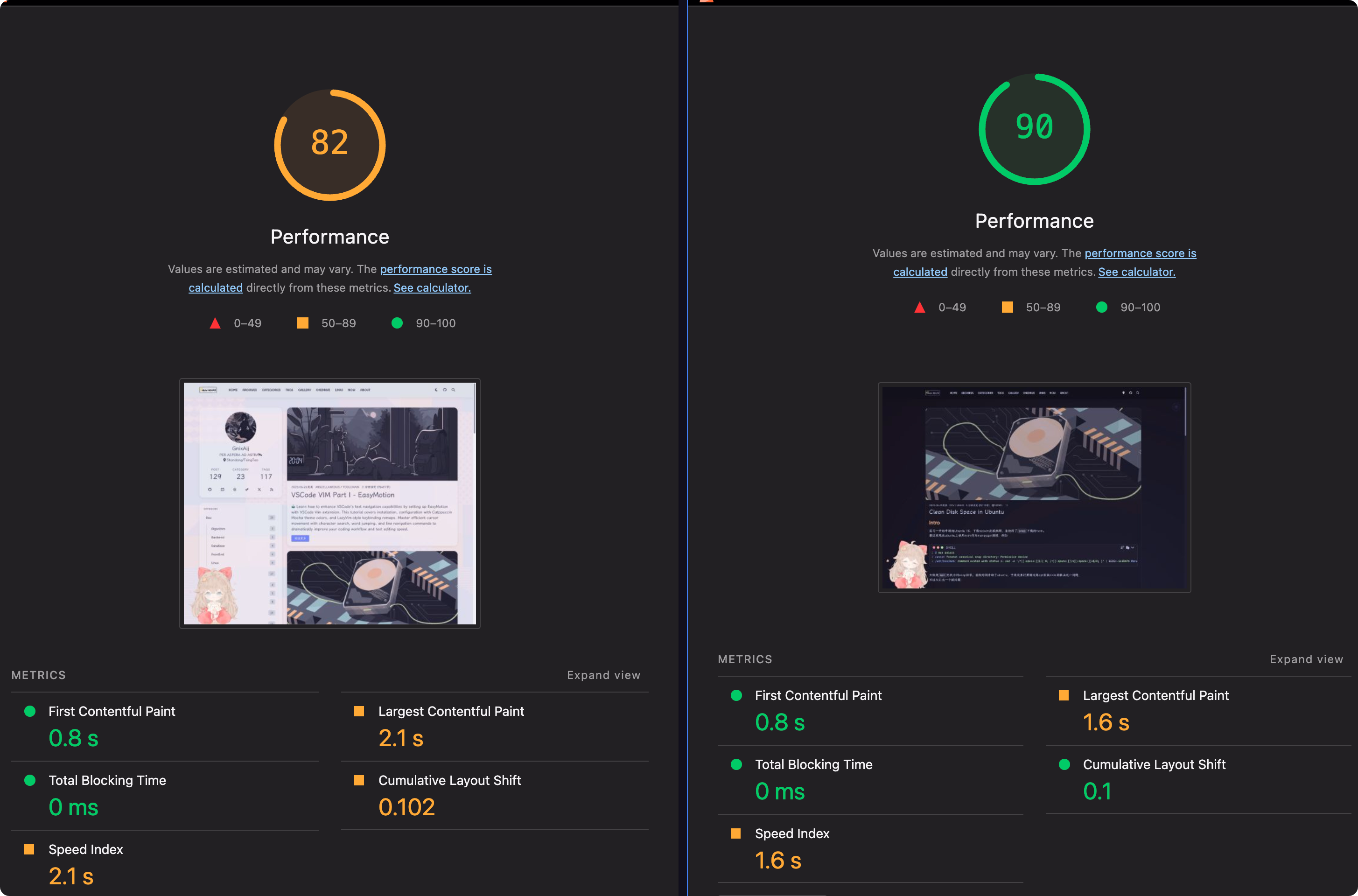
以个人博客为例,网页的 LCP 通常就是博文的封面; 当封面图片体积比较大时,那 LCP 评分就相对比较低;一般来说 LCP 的理想时间是 2.5s 之内
LCP
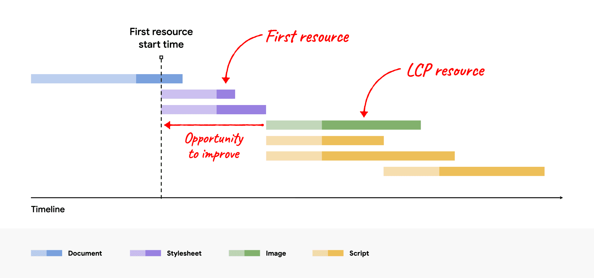
每个 Page 的 LCP 可以被分解下面四个连续(时间上连续,没有重叠)的子部分
| LCP subpart | % of LCP | Description |
|---|---|---|
| Time to first byte (TTFB) | ~40% | The time from when the user initiates loading the page until the browser receives the first byte of the HTML document response. |
| Load delay | <10% | The time between TTFB and when the browser starts loading the LCP resource. If the LCP element doesn’t require a resource load to render (for example, if the element is a text node rendered with a system font), this time is 0. |
| Load time | ~40% | The duration of time it takes to load the LCP resource itself. If the LCP element doesn’t require a resource load to render, this time is 0. |
| Render delay | <10% | The time between when the LCP resource finishes loading and the LCP element rendering fully. |
Load Delay
Optimize Largest Contentful Paint | Articles | web.dev
The goal in this step is to ensure the LCP resource starts loading as early as possible. While in theory the earliest a resource could start loading is immediately after TTFB, in practice there is always some delay before browsers actually start loading resources.
简单概括来说,加载延迟指的是从 TTFB 结束到浏览器开始下载 LCP 资源(通常是主图或大段文本)之间的那段“等待期”。产生这段延迟的核心原因是:浏览器此时还不知道哪个资源是需要优先加载的关键内容,它需要先解析一部分 HTML 或 CSS 才能发现它。
👍 Do
我们应该在 HTML 的 <head> 区域使用 <link rel="preload" fetchpriority="high"> 标签,告诉浏览器:“这个资源(图片或者第三方字体文件 e.g.)是重要的,尽早开始下载”
👎 Don’t
懒加载(Lazy Loading)是前端性能优化非常常用的技术,它通过推迟加载非可视区域的资源来提升初始加载速度。但应用的时候需要如果将其错误地应用于 LCP 元素上,避免导致 LCP 的“加载延迟”阶段变长,与 LCP 优化的目标完全相悖
Example from Optimize Largest Contentful Paint | Articles | web.dev<!-- Load the stylesheet that will reference the LCP image. --><link rel="stylesheet" href="/path/to/styles.css" /><!-- Preload the LCP image with a high fetchpriority so it starts loading with the stylesheet. --><link rel="preload" fetchpriority="high" as="image" href="/path/to/hero-image.webp" type="image/webp"/>
Load Time
The goal of this step is to reduce the time spent transferring the bytes of the resource over the network to the user’s device.
Load Time 通常与传输的字节数成正比,提升该指标的建议也往往是从减少字节数出发,此外还可以加快传输速度,或者减少传输距离
- 减少资源体积
- Efficiently Encode Images…
- Serve responsive Images…
- 字体加载也可以优化,比如拆分字体,用 woff2 格式等,本文主要围绕图片的优化,这里不对字体作更进一步介绍
- 加快传输速度
- 服务器宽带,使用 CDN etc.
传输速度这里就不展开了,套 CDN,国内外分流等措施都可以试一下
Efficiently Encode Images
比较容易的操作方案,图片使用新一代的编码格式,例如 avif, WebP; Google 推出了一个 CLI 工具叫做 cwebp,另外个人之前的博客中,介绍的 gowall 工具也可以将图片转为 WebP格式
日常写作可以使用 PicList 作为上传图片的工具,工作流可以稍微简化一些
搜集图片->上传图片(PicList自动将格式转为avif/WebP)->自动复制链接到剪切板
Server Responsive Images
Responsive images are a set of techniques used to load the right image based on device resolution, orientation, screen size, network connection, and page layout. The browser should not stretch the image to fit the page layout, and loading it shouldn’t result in wasted time or bandwidth. This improves user experience, as images load quickly and look crisp to the human eye.
在 DevTools 中,可以查看某一图片的 Rendered Size & Intrinsic Size,如果他们之间相差过大,那么在跑 LightHouse 时,可能会遇到Properly size images的警告,例如 This image file is larger than it needs to be(6144 x 2630) for its displayed dimensions(1199x800). Use responsive images to reduce the image download size;
关于响应式图片的原理/概念介绍,参考responsive_image
Method 1. Self-Host With Sharp & CI/CD Pipeline
基本原理 : 根据用户设备的屏幕尺寸、分辨率等条件,动态提供最适合的图片版本,避免在小屏设备上加载过大的图片。
实现方式:
- 修改 CICD PipeLine,在部署的时候,使用
sharp等工具,自动生成不同尺寸的图片 - 修改博客主题,为
<img>等资源设置srcset属性
对比效果
我测试时最新的文章是vscode_easymotion, hero image 是从 catppuccin discord 下的壁纸,资源大小对比如下,优化效果还是不错的
| Format | Resolution | Size |
|---|---|---|
| png | 6144 x 4096 | 6.8MB |
| WebP | 6144 x 4096 | 3.5MB |
| WebP(2000w) | 2000 x 1333 | 68.0kB |
Step 1: 生成不同尺寸的图片
一些图床服务的提供商会提供自动生成不同尺寸的图片的功能,但我是使用的 Cloudflare R2 作为图床,存储博客中的图片。而对于 Hexo 博客的封面图/缩略图等资源,就是直接放在博客下的 source/assets/cover和 source/assets/thumbnails目录下;Blog 的 YAML Front Matter 类似于下面这样---title: VSCode VIM Part I - EasyMotiondate: 2025-06-26thumbnail: /assets/thumbnails/vscode_vim.webpcover: https://assets.vluv.space/cover/ToolChain/easymotion.webptags: [VSCode, Vim, Catppuccin, EasyMotion]---Your blog post content goes here...
针对个人的图片存放方式,可以在 <your_blog>/scripts目录(当然也可以放其他地方)下创建一个 responsive_images.js脚本,用来生成不同尺寸的图片const sharp = require("sharp");const fs = require("fs");const path = require("path");// NOTE 这里替换成存放图片的目录// 例如:'../source/assets/cover' 和 '../source/assets/thumbnails'const imageDirs = [ path.join(__dirname, "../source/assets/cover"), path.join(__dirname, "../source/assets/thumbnails"),];const widths = [128, 256, 800, 1500, 2000];// Recursive function to find all files in a directoryasync function getFiles(dir) { const dirents = await fs.promises.readdir(dir, { withFileTypes: true }); const files = await Promise.all( dirents.map((dirent) => { const res = path.resolve(dir, dirent.name); return dirent.isDirectory() ? getFiles(res) : res; }) ); return Array.prototype.concat(...files);}async function processImages() { try { let allFiles = []; for (const dir of imageDirs) { if (fs.existsSync(dir)) { console.log("Scanning for images in:", dir); const files = await getFiles(dir); allFiles = allFiles.concat(files); } } const imageFiles = allFiles.filter( (file) => /\.(jpg|jpeg|png|webp|avif)$/i.test(file) && !/-\d+w\.(jpg|jpeg|png|webp|avif)$/i.test(file) ); if (imageFiles.length === 0) { console.log("No new images to process."); return; } console.log(`Found ${imageFiles.length} images to process.`); for (const imagePath of imageFiles) { const { dir, name, ext } = path.parse(imagePath); for (const width of widths) { const newFileName = `${name}-${width}w${ext}`; const newFilePath = path.join(dir, newFileName); if (fs.existsSync(newFilePath)) { // console.log(`Skipping, already exists: ${newFileName}`); continue; } try { await sharp(imagePath) .resize(width) .toFile(newFilePath); console.log(`✅ Generated: ${newFileName}`); } catch (err) { console.error( `❌ Failed to process ${imagePath} for width ${width}:`, err ); } } } console.log("\nImage processing complete!"); } catch (error) { console.error("An error occurred during image processing:", error); }}// Only run image processing in CI environmentif (process.env.RESPONSIVE_IMAGES === "true") { console.log("CI environment detected. Running image processing script..."); processImages();} else { console.log("Local environment detected. Skipping image processing.");}
Step 2: 设置 CI/CD Pipeline
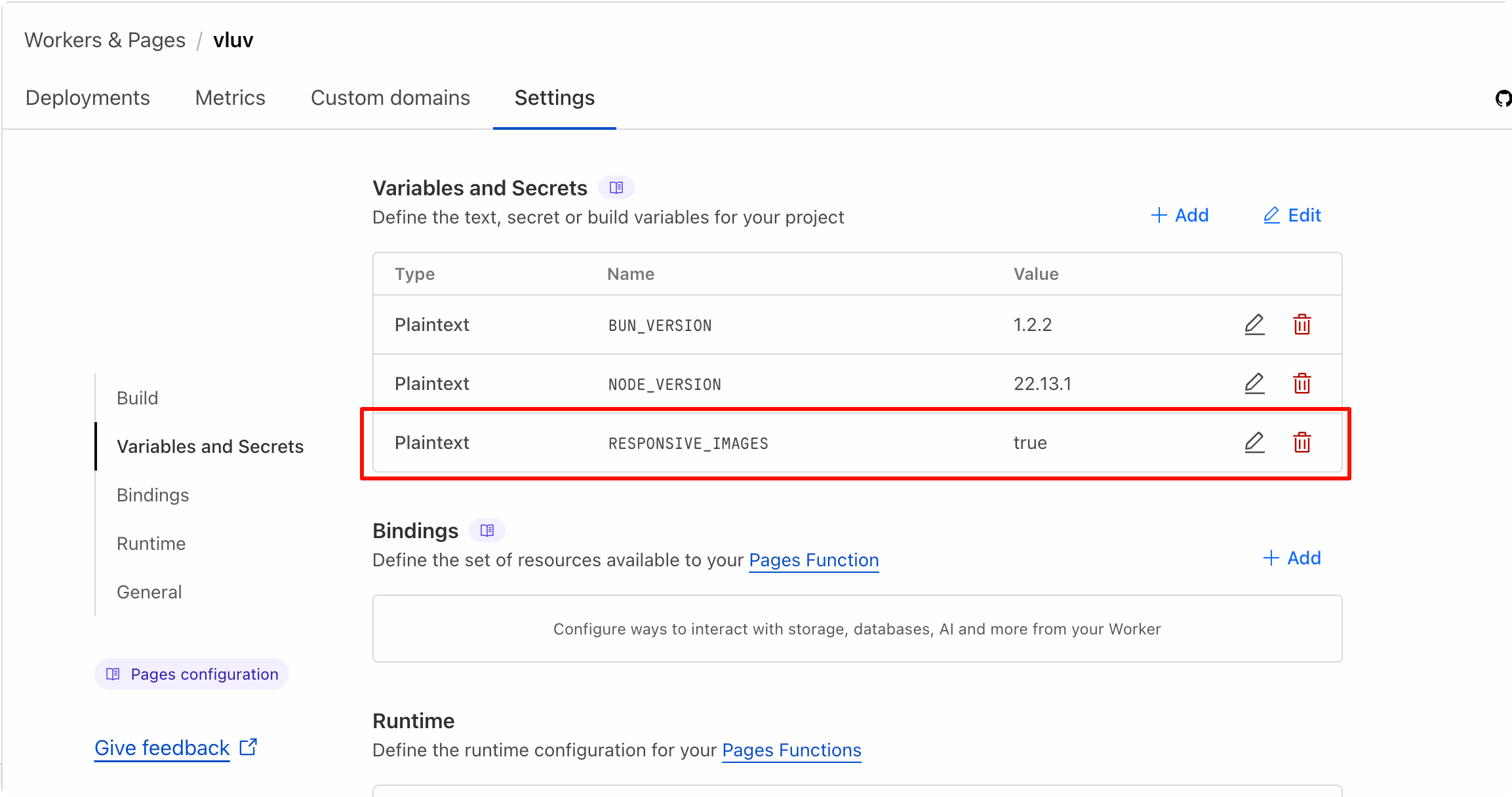
一般来说,托管静态博客的 Pipe Line 会让用户分别指定
修改博客的 脚本会读取 以 Cloudflare Pages 为例,可以在项目设置中添加环境变量 如何在主题中应用 package.json 文件,scripts 部分的 build 脚本中添加 node scripts/generate_responsive_images.js,使其在生成静态页面之前运行脚本{ "name": "hexo-site", "version": "0.0.0", "private": true, "scripts": { "build": "hexo gen", "build": "node scripts/generate_responsive_images.js && hexo gen", "clean": "hexo clean", "deploy": "hexo deploy", "server": "hexo server" }, ...}
RESPONSIVE_IMAGES环境变量,如果为 true,则会执行图片处理逻辑;否则跳过处理;这样可以只在 CI/CD 环境中运行脚本,而在本地测试时不执行图片处理;RESPONSIVE_IMAGES,并设置为 truesrcset,以个人使用的 Icarus 主题为例,可以参考本人的这两个 git commit:
Method 2. Using CDN Provider’s API
CoreIX 是缤纷云自研的,具有高度自动化、智能化、高兼容性的高性能实时媒体处理引擎。
S4 对象存储中的媒体内容可以简单地通过在 Url 末尾(或在 GetObject 接口中)携带相关 处理参数 轻松获得 CoreIX 的 所有丰富功能。
https://demo.bitiful.com/girl.jpeg?&w=300https://demo.bitiful.com/girl.jpeg?&fmt=avifgirl.jpeg&w?=300 | girl.jpeg?&w=300&fmt=avif |
|---|---|
 |  |
使用 CDN 提供商的服务就不需要在 CICD Pipeline 里处理图片了
Ref
- Largest Contentful Paint | Lighthouse | Chrome for Developers
- Optimize Largest Contentful Paint | Articles | web.dev
- Serve responsive images | Articles | web.dev
- Efficiently encode images | Lighthouse | Chrome for Developers
- Window: devicePixelRatio property - Web APIs | MDN
- Responsive Images - A Reference Guide from A to Z | ImageKit.io
- Responsive Images Done Right: A Guide To And srcset — Smashing Magazine
- HTMLImageElement: srcset property - Web APIs | MDN
- CoreIX 概述 - 缤纷云文档
Making Web Fast —— LCP Optimization