﻿---
title: UI/UX Terminology
date: 2026-02-02
tags:
  - UIUX
  - Web
excerpt: "Why is it called a Radio Button, a Breadcrumb, a Toast? These UI terms trace back to car radios, Grimm's fairy tales, and toasters — metaphors early GUI designers borrowed from the real world."
updated: 2026-07-08 21:26:19
lang: en
i18n:
  cn: /uiux_terms
  translation: 2
---

## Radio ☉

> Radio buttons typically occur in groups; they're round and are filled in with a black circle when on. They're called radio buttons because they act like the buttons on a car radio.
>
> *Inside Macintosh Volume I, p.66, 1985*

<script type="module" src="/js/components/text-image-section.js"></script>

<text-image-section image="https://assets.vluv.space/ui-radio-button.avif" alt="car radio">

Mid-century car radios had a row of mechanical buttons for preset stations. Press one and it stays down while popping the others back up — this "press A, release B" mutual exclusion is exactly where the name Radio Button comes from.
When <abbr class="abbr" title="Graphical User Interface">GUI</abbr> designers brought this interaction to the screen, it became a classic form control: it restricts the user to picking exactly one option from a group. Click an option, and the previously selected one is deselected automatically.

</text-image-section>

<p style="font-family: var(--font-serif)">1. How much is the shirt?</p>

<div>
  <style>
    .radio-group {
      display: flex;
      padding: 0 20px;
      font-family: var(--font-serif);
    }
    .radio-item {
      display: flex;
      align-items: center;
      gap: 12px;
      cursor: pointer;
      padding: 8px 12px;
      transition: background 0.2s;
    }
    .radio-item input[type="radio"] {
      appearance: none;
      width: 20px;
      height: 20px;
      border: 2px solid var(--blue);
      border-radius: 50%;
      cursor: pointer;
      position: relative;
      transition: all 0.2s;
    }
    .radio-item input[type="radio"]:checked {
      background: var(--blue);
      border-color: var(--blue);
    }
    .radio-item input[type="radio"]:checked::after {
      content: '';
      position: absolute;
      top: 50%;
      left: 50%;
      transform: translate(-50%, -50%);
      width: 8px;
      height: 8px;
      background: white;
      border-radius: 50%;
    }
    .radio-item label {
      cursor: pointer;
      color: var(--text);
      font-weight: 500;
    }
    .radio-item input[type="radio"]:focus {
      outline: 2px solid var(--blue);
      outline-offset: 2px;
    }
  </style>
  <div class="radio-group">
    <div class="radio-item">
      <input type="radio" name="price" value="A" id="priceA" checked>
      <label for="priceA">[A] £19.15</label>
    </div>
    <div class="radio-item">
      <input type="radio" name="price" value="B" id="priceB">
      <label for="priceB">[B] £9.18</label>
    </div>
    <div class="radio-item">
      <input type="radio" name="price" value="C" id="priceC">
      <label for="priceC">[C] £9.15</label>
    </div>
  </div>
</div>

### Modal/Modalless Dialog 💬

> A mode is a part of an application that the user has to formally enter and leave, and that restricts the operations that can be performed while it's in effect.
>
> *Inside Macintosh Volume I, p.28, 1985*
>
>  ---
>
> A modal dialog box is one that the user must explicitly dismiss before doing anything else... the main use of a modal dialog box is when it's important for the user to complete an operation before doing anything else.
>
> A modeless dialog box allows the user to perform other operations without dismissing the dialog box.
>
> *Inside Macintosh Volume I, p.67-68, 1985*

In human-computer interaction there's a common kind of component: it appears on top of the main page, and the user must finish interacting with it before returning to the page. A nice design touch is to blur the rest of the screen, pulling the user's attention ==toward it==.

The industry usually calls this component a **Modal**. Going by the wording in *Inside Macintosh Volume I*, the noun **Mode** actually feels like the better fit; Modal works better as a prefix for components, e.g. Modal Dialog, Modal Searchbox, and so on.

<div class="component-demo">
  <style>
    .kbd-demo {
      padding: 30px;
      display: flex;
      gap: 30px;
      justify-content: center;
      flex-wrap: wrap;
    }
    .kbd-group {
      display: flex;
      flex-direction: column;
      align-items: center;
      gap: 12px;
      kbd {
        font-size: 2em;
      }
    }
    .kbd-action {
      font-size: 0.8em;
      color: var(--subtext0);
    }
  </style>
  <div class="kbd-demo">
    <div class="kbd-group">
      <kbd onclick='document.getElementById("toc-body")?.togglePopover()'>
        ⌘ + T
      </kbd>
      <span class="kbd-action">Modal TOC</span>
    </div>
    <div class="kbd-group">
      <kbd onclick="document.querySelector('#theme-selector-popover')?.showPopover()">
        ⌘ + P
      </kbd>
      <span class="kbd-action">Modal Theme Selector</span>
    </div>
    <div class="kbd-group">
      <kbd onclick='document.querySelector("#searchbox")?.showPopover()'>
        ⌘ + K
      </kbd>
      <span class="kbd-action">Modal Searchbox</span>
    </div>
  </div>
</div>

**Dialog** is literal: a "conversation" between the computer and the user. Combined with Modal, you can design components that deliberately interrupt the user:

- Warnings before overwriting/deleting a file
- Login/signup flows

## Breadcrumbs 🍞

The Grimm brothers' *Hänsel und Gretel* tells this story:

<text-image-section image="https://assets.vluv.space/Hänsel_und_Gretel.avif" alt="Hänsel und Gretel illustration">

A poor couple, driven by famine, twice abandon their children Hänsel and Gretel in the forest. The first time, Hänsel drops pebbles along the way, and the siblings follow their glint back home. The second time he drops breadcrumbs, but birds eat them all; the two get lost and stumble into a witch's gingerbread house...

The breadcrumb component borrows exactly this metaphor, helping users see the path they took and navigate back up a level.

</text-image-section>

<div>
  <style>
    .breadcrumb {
      padding: 16px 20px;
      font-family: var(--font-mono);
    }
    .breadcrumb-list {
      display: flex;
      flex-wrap: wrap;
      align-items: center;
      list-style: none;
      margin: 0;
      padding: 0;
    }
    .breadcrumb-item {
      display: flex;
      align-items: center;
    }
    .breadcrumb-item a {
      color: var(--blue);
      text-decoration: none;
      transition: color 0.2s;
    }
    .breadcrumb-item a:hover {
      color: var(--blue);
      text-decoration: underline;
    }
    .breadcrumb-separator {
      color: var(--subtext0);
    }
    .breadcrumb-item.active {
      color: var(--text);
      font-weight: 500;
    }
  </style>
  <nav class="breadcrumb" aria-label="Breadcrumb">
    <ol class="breadcrumb-list">
      <li class="breadcrumb-separator">/</li>
      <li class="breadcrumb-item">
        <a href="/archives">📚 Archives</a>
      </li>
      <li class="breadcrumb-separator">/</li>
      <li class="breadcrumb-item">
        <a href="/archives/2026">📂 2026</a>
      </li>
      <li class="breadcrumb-separator">/</li>
      <li class="breadcrumb-item active">uiux_terms</li>
    </ol>
  </nav>
</div>

Common places you'll see it:

- File managers, e.g. Windows Explorer.exe and macOS Finder.app
- The [archive](/archives) page of this site, where I use it for year/month navigation
- [VSCode has breadcrumbs too](https://code.visualstudio.com/docs/editing/editingevolved#_breadcrumbs), letting you jump quickly between folders, files, and symbols

## Hamburger 🍔

> Its graphic design was meant to be very "road sign" simple, functionally memorable, and mimic the look of the resulting displayed menu list. —— Norm Cox
>
> *Source [The origin of the hamburger icon](https://lite.evernote.com/note/022f2237-4b4f-4096-87f2-053acd228c2d)*

The most familiar one of all. The hamburger. Iconic. Needs no introduction 👍

The three-line icon is called the "hamburger menu" because it looks like a burger: two buns with a patty in between. **Norm Cox** designed it in 1981 for the [Xerox Star](https://en.wikipedia.org/wiki/Xerox_Star) operating system. Windows used it the following year, then dropped it. But with the rise of mobile, the hamburger became a regular sight again on Android and iOS.

<div class="component-demo">
  <style>
    .realistic-burger {
      margin: auto;
      width: 3em;
      height: 3em;
      border: none;
      border-radius: 0.75em;
      background: transparent;
      cursor: pointer;
      display: flex;
      flex-direction: column;
      justify-content: center;
      align-items: center;
      gap: 0.2em;
      transition: background 0.2s;
      font-size: 24px;
      .bun-top {
        width: 1.4em;
        height: 0.28em;
        background: linear-gradient(to bottom, var(--peach) 0%, var(--yellow) 100%);
        border-radius: 1em 1em 0.3em 0.3em;
        transition: transform 0.3s, opacity 0.3s;
        box-shadow: inset 0 -2px 3px rgba(0,0,0,0.1);
      }
      .patty {
        width: 1.5em;
        height: 0.22em;
        background: linear-gradient(to bottom, var(--green) 10%, var(--maroon) 30%, var(--red) 100%);
        border-radius: 4px;
        transition: transform 0.3s, opacity 0.3s;
        box-shadow: 0 1px 2px rgba(0,0,0,0.2);
      }
      .bun-bottom {
        width: 1.4em;
        height: 0.25em;
        background: linear-gradient(to bottom, var(--yellow) 0%, var(--peach) 100%);
        border-radius: 0.3em 0.3em 0.8em 0.8em;
        transition: transform 0.3s, opacity 0.3s;
        box-shadow: inset 0 2px 3px rgba(0,0,0,0.1);
      }
    }
    .realistic-burger.active .bun-top {
      transform: translateY(0.44em) rotate(45deg);
      border-radius: 3px;
    }
    .realistic-burger.active .patty {
      opacity: 0;
    }
    .realistic-burger.active .bun-bottom {
      transform: translateY(-0.44em) rotate(-45deg);
      border-radius: 3px;
    }
  </style>
  <button class="realistic-burger" aria-label="Toggle menu" onclick="this.classList.toggle('active')">
    <span class="bun-top"></span>
    <span class="patty"></span>
    <span class="bun-bottom"></span>
  </button>
</div>

Where to find it:

- Visit [vluv.space](https://vluv.space) on mobile and grab your little 🍔 in the top-right corner
- The TOC on this site uses a burger component too

## Toast & Snackbar 🍞

Toast, as in a slice of toasted bread. The inspiration comes from the toaster: when the bread is done, it pops up out of the machine. Snackbar literally means a snack counter, again hinting that the component is quick and lightweight.

Both components are **modalless**: they don't interrupt the user, and they disappear on their own after a while. What sets Snackbar apart is that it usually pairs "message + action", where the action can be retry, undo, and so on.

<div class="component-demo">
  <div class="bread-controls">
    <button onclick="handleToast()">🥪 Add bread (+3)</button>
    <button onclick="handleSnackbar()">🍞 Clear plate</button>
  </div>

  <div id="toast" class="notify toast"></div>

  <div id="snackbar" class="notify snackbar">
    <span id="snackbar-text"></span>
    <button class="action-btn" onclick="undoClear()">Undo</button>
  </div>

  <style>
    .component-demo {
      /* Component-scoped variables */
      position: relative;
      padding: 40px 20px;
      display: flex;
      justify-content: center;
      font-family: var(--font-mono);
    }

    /* Button group styles */
    .bread-controls {
      display: flex;
      gap: 12px;
      align-items: flex-start;
    }

    .bread-controls button {
      padding: 8px 16px;
      font-size: 1.1em;
      background: var(--crust);
      border: 1px solid var(--surface0);
      color: var(--text);
      border-radius: 6px;
      cursor: pointer;
      font-weight: 500;
      transition: all 0.2s;
    }

    .notify {
      position: fixed;
      left: 50%;
      transform: translate(-50%, 20px);
      opacity: 0;
      visibility: hidden;

      padding: 12px 16px;
      border-radius: 8px;
      background: var(--crust);
      border: 1px solid var(--surface0);
      color: var(--text);
      box-shadow: 0 4px 12px rgba(0,0,0,0.15);
      font-size: 14px;
      z-index: 1000;

      display: flex;
      align-items: center;
      gap: 12px;
      transition: all 0.3s cubic-bezier(0.2, 0.8, 0.2, 1);
    }

    /* Active state: float back into place, fully opaque */
    .notify.active {
      opacity: 1;
      visibility: visible;
      transform: translate(-50%, 0);
    }

    .toast {
      /* Position: lower part of the screen (Android style) */
      bottom: 100px;
      min-width: 200px;
      justify-content: center;
      border-radius: 20px; /* Toasts are usually rounder */
    }

    /* --- Snackbar-specific styles --- */
    .snackbar {
      /* Position: very bottom of the screen */
      bottom: 24px;
      min-width: 300px;
      justify-content: space-between;
    }

    /* Button inside the Snackbar */
    .action-btn {
      background: transparent;
      border: 1px solid var(--surface0);
      color: var(--text);
      padding: 6px 12px;
      border-radius: 4px;
      cursor: pointer;
      font-size: 13px;
      transition: 0.2s;
    }
    .action-btn:hover {
      background: var(--mantle);
    }
  </style>

  <script>
    let breadCount = 0;
    let prevCount = 0;
    let toastTimer, snackTimer;

    const toastEl = document.getElementById('toast');
    const snackbarEl = document.getElementById('snackbar');
    const snackTextEl = document.getElementById('snackbar-text');

    // Core show logic
    function show(element, timerId, duration) {
      clearTimeout(timerId); // Clear the previous countdown

      // Reset animation state (remove -> force reflow -> add)
      element.classList.remove('active');
      void element.offsetWidth;
      element.classList.add('active');

      // Schedule auto-dismiss
      return setTimeout(() => {
        element.classList.remove('active');
      }, duration);
    }

    function handleToast() {
      breadCount += 3;
      toastEl.innerText = `🥪 Slices: ${breadCount}`;
      // Toasts show briefly (1.5s)
      toastTimer = show(toastEl, toastTimer, 1500);
    }

    function handleSnackbar() {
      if (breadCount === 0 && prevCount === 0) return;

      prevCount = breadCount;
      breadCount = 0;

      // Update the UI
      toastEl.innerText = `🥪 Slices: ${breadCount}`;
      snackTextEl.innerText = `Plate cleared (${prevCount} slices)`;
      // Snackbars stay longer (3s)
      snackTimer = show(snackbarEl, snackTimer, 3000);
    }
    function undoClear() {
      breadCount = prevCount;
      toastEl.innerText = `🥪 Slices: ${breadCount}`;
      // Close the Snackbar immediately and confirm the undo via a Toast
      snackbarEl.classList.remove('active');
      toastTimer = show(toastEl, toastTimer, 1500);
    }
  </script>
</div>

### Sonner 🔔

> The way I came up with Sonner is I looked up French words related to notifications. Sonner, which means "to ring" was one of them... While I'm sacrificing discoverability and clarity, it feels elegant to me.
>
> *Emil Kowalski, [Building a toast component](https://emilkowal.ski/ui/building-a-toast-component), 2024*

Sonner is a popular React toast library, released in 2023 by design engineer **Emil Kowalski**. Unlike plainly functional names such as `react-toast` or `react-snackbar`, the author picked something more elegant: the French verb **sonner**, "to ring".

Just as a doorbell rings to announce a visitor, a toast "rings" to tell the user something happened, without getting in the way. The name sacrifices some discoverability (developers may not find it on a first search), but it wins on simple elegance.

<div class="component-demo">
  <style>
    .sonner-demo-container {
      position: relative;
    }
    .sonner-btn-group {
      display: flex;
      gap: 12px;
      flex-wrap: wrap;
      justify-content: center;
    }
    .sonner-btn {
      padding: 10px 20px;
      font-size: 14px;
      font-weight: 500;
      border: none;
      border-radius: 8px;
      cursor: pointer;
      transition: all 0.2s;
      font-family: var(--font-mono);
    }
    .sonner-btn-success {
      background: var(--green);
      color: var(--base);
    }
    .sonner-btn-error {
      background: var(--red);
      color: var(--base);
    }
    .sonner-btn:hover {
      transform: translateY(-2px);
      box-shadow: 0 4px 12px rgba(0, 0, 0, 0.15);
    }
    .sonner-toast-container {
      position: fixed;
      bottom: 24px;
      right: 24px;
      display: flex;
      flex-direction: column;
      gap: 8px;
      z-index: 1000;
      pointer-events: none;
    }
    .sonner-toast {
      pointer-events: auto;
      padding: 16px 20px;
      background: var(--base);
      border: 1px solid var(--surface0);
      border-radius: 10px;
      box-shadow: 0 4px 12px rgba(0, 0, 0, 0.15), 0 0 0 1px rgba(0, 0, 0, 0.05);
      font-size: 14px;
      font-family: var(--font-mono);
      color: var(--text);
      display: flex;
      align-items: center;
      gap: 10px;
      transform: translateX(120%);
      opacity: 0;
      transition: all 0.3s cubic-bezier(0.21, 1.02, 0.73, 1);
      min-width: 280px;
    }
    .sonner-toast.show {
      transform: translateX(0);
      opacity: 1;
    }
    .sonner-toast.hiding {
      transform: translateX(120%);
      opacity: 0;
    }
    .sonner-toast-icon {
      font-size: 18px;
      flex-shrink: 0;
    }
    .sonner-toast-content {
      flex: 1;
    }
    .sonner-toast-title {
      font-weight: 600;
      margin-bottom: 2px;
    }
    .sonner-toast-desc {
      font-size: 13px;
      color: var(--subtext0);
    }
    .sonner-toast.success {
      border-color: var(--green);
    }
    .sonner-toast.error {
      border-color: var(--red);
    }
  </style>
  <div class="sonner-demo-container">
    <div class="sonner-btn-group">
      <button class="sonner-btn sonner-btn-success" onclick="showSonnerToast('success')">Balance -100</button>
      <button class="sonner-btn sonner-btn-error" onclick="showSonnerToast('error')">Balance +100</button>
    </div>
  </div>
  <div class="sonner-toast-container" id="sonner-toast-container"></div>

  <script>
    const sonnerContainer = document.getElementById('sonner-toast-container');
    const sonnerConfig = {
      success: { icon: '✅', title: 'Success!', desc: 'Changes have been saved.' },
      error: { icon: '❌', title: 'Error', desc: 'Something went wrong. Please try again.' }
    };

    function showSonnerToast(type) {
      const config = sonnerConfig[type];
      const toast = document.createElement('div');
      toast.className = `sonner-toast ${type}`;
      toast.innerHTML = `
        <span class="sonner-toast-icon">${config.icon}</span>
        <div class="sonner-toast-content">
          <div class="sonner-toast-title">${config.title}</div>
          <div class="sonner-toast-desc">${config.desc}</div>
        </div>
      `;

      sonnerContainer.appendChild(toast);
      // Trigger animation
      requestAnimationFrame(() => {
        toast.classList.add('show');
      });

      // Auto dismiss
      setTimeout(() => {
        toast.classList.remove('show');
        toast.classList.add('hiding');
        setTimeout(() => toast.remove(), 300);
      }, 3000);
    }
  </script>
</div>

Today Sonner is one of the most popular toast libraries in the React ecosystem: over 8 million npm downloads a week, the default toast component of [shadcn/ui](https://ui.shadcn.com/), and in use by products like Cursor, X, and Vercel.

## Carousel 🎠

The word Carousel comes from the French "carrousel"[^1], usually meaning the large, ornately decorated merry-go-round at an amusement park. By extension it also names rotating machinery like the baggage/luggage carousel at airports.

On screen, the Carousel component behaves like a merry-go-round: it spins in one direction, looping forever. The most annoying use is rotating ad banners, though a quick scroll gets past them; the worst offender is still the popup (let's file that under Modal Dialog).

A few use cases where it fits well:

- Showing different views of a product
- Photography galleries

<script type="module" src="/js/components/device-carousel.js"></script>

<device-carousel></device-carousel>

## Accordion 🪗

The Accordion component lets users expand or collapse content sections, like the bellows of an accordion stretching and squeezing.

One of my favorite components. When a piece of content covers many topics, it's a great fit, FAQs for example. The page stays tidy, and users can pick just the parts they care about.

<link rel="stylesheet" href="/css/optional/accordion.css">

<div class="accordion">
<details class="accordion-item" name="accordion-uiux_terms-1">
  <summary>Introduction</summary>
    Welcome to the introduction section. Here you can learn about the basics of UI components.
</details>
<details class="accordion-item" name="accordion-uiux_terms-1">
  <summary>Design Patterns</summary>
    Design patterns help us create consistent and intuitive user interfaces.
</details>
<details class="accordion-item" name="accordion-uiux_terms-1">
  <summary>Implementation</summary>
    Learn how to implement these components in your projects with code examples.
</details>
</div>

## Avatar 👾

Avatar comes from the Sanskrit word avatarana. In Hinduism it refers specifically to a deity descending to earth in bodily form (human or animal) to restore cosmic order.[^2]

This theological term turns out to have quite a history in computing. Early geeks and sci-fi writers first brought it into the field. The following section was drafted with help from Gemini.

> [!CITE]- How "Avatar" evolved
>
> - **Earliest appearance** (1979 - PLATO)
>     The word first showed up in the game Avatar on the early multi-user PLATO system, though at the time it mostly named the game itself.
> - **Given philosophical weight** (1985 - Ultima IV) [^3]
>     The famous role-playing game *Ultima IV: Quest of the Avatar* was a milestone. Designer Richard Garriott wanted players to do more than move a game piece — he wanted them morally accountable for their actions. He called the player character **"The Avatar"**, implying that the figure on screen is **a vessel for the real player's soul outside the screen**.
> - **The visual definition takes hold** (1986 - Habitat)
>     This is the key moment when Avatar became the "profile picture / embodiment" we know today.
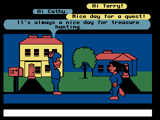
>     Lucasfilm Games built **Habitat**, the earliest large-scale multiplayer online community. Developers Chip Morningstar and F. Randall Farmer were the first to formally use **Avatar** for **the little figure the user controls on screen**.
>     > The largest part of the screen is devoted to the graphics display. This is an animated view of the player's current location in the Habitat world. The scene consists of various objects arrayed on the screen, such as the houses and tree you see here. The players are represent by animated figures that we call "Avatars". Avatars are usually, though not exclusively, humanoid in appearance. In this scene you can see two of them, carrying on a conversation.
>     > ![Habitat](https://assets.vluv.space/Habitat.avif)
> - **Going mainstream (1992 - Snow Crash)**
>     Neal Stephenson's cyberpunk classic *Snow Crash* pushed the concept to a mass audience. The book depicts a virtual world called the "Metaverse" where people socialize through **Avatars**. It defined the modern internet's imagination of the Avatar: it can be a projection of your real self, or the self you fantasize about.
> - **Modern usage: from full body to "headshot"**
>     As the internet grew, the meaning of Avatar split:
>     1. **Games/VR**: still keeps the "full-body embodiment" sense (think World of Warcraft characters or Apple's Memoji).
>     2. **Social networks/forums**: on early forums (BBS) and instant messengers (ICQ, QQ, MSN), bandwidth and screen space compressed the user's representation into a small static image.
>         - The form shrank to a 2D square, but we kept the word **Avatar** (in web development it usually means that round or square user picture).
>         - In Chinese we more commonly call it 头像, while English UI design systems (Material Design, Ant Design) still name the component **Avatar**.
>
>     In digital UI design, the Avatar stands for a user's **digital identity or virtual persona**, usually shown as a round or square profile picture. It has become the core component for **user recognition and personalization** in modern apps.

<div class="component-demo">
  <style>
    .avatar-demo {
      padding: 30px;
      display: flex;
      gap: 40px;
      align-items: center;
      justify-content: center;
    }
    .avatar-item {
      display: flex;
      flex-direction: column;
      align-items: center;
      gap: 12px;
    }
    .avatar {
      width: 64px;
      height: 64px;
      border-radius: 50%;
      display: flex;
      align-items: center;
      justify-content: center;
      font-size: 28px;
      font-weight: 600;
      color: white;
      box-shadow: 0 4px 12px rgba(0, 0, 0, 0.15);
      transition: transform 0.2s, box-shadow 0.2s;
    }
    .avatar:hover {
      transform: translateY(-4px);
      box-shadow: 0 8px 24px rgba(0, 0, 0, 0.2);
    }
    .avatar-blue { background: var(--mauve); }
    .avatar-green { background: var(--green); }
    .avatar-peach { background: var(--peach); }
    .avatar-label {
      font-size: 13px;
      color: var(--overlay0);
    }
  </style>
  <div class="avatar-demo">
    <div class="avatar-item">
      <div class="avatar avatar-blue">JD</div>
      <span class="avatar-label">John Doe</span>
    </div>
    <div class="avatar-item">
      <div class="avatar avatar-green">AS</div>
      <span class="avatar-label">Alice Smith</span>
    </div>
    <div class="avatar-item">
      <div class="avatar avatar-peach">BJ</div>
      <span class="avatar-label">Bob Jones</span>
    </div>
  </div>
</div>

## Spinner & Skeleton Screen ⏳

> [!CITE]- [Etymology of "spinner"](https://www.etymonline.com/word/spinner)
>
>  Around 1300, the word meant "spider", derived as a noun from the verb [spin](https://www.etymonline.com/word/spin "Etymology, meaning and definition of spin"). The sense "one who spins thread" appeared in the late 14th century (late 13th century as a surname), usually referring to women. The OED notes that *spinner* in the "spider" sense was fairly common between 1530 and 1615; today that use is mostly dialectal or rhetorical.

The endlessly rotating loading circle was everywhere on early web pages; the term is Spinner. More modern pages and apps tend to avoid it, see [Mobile Design Details: Avoid The Spinner](https://www.lukew.com/ff/entry.asp?1797).

In the days of slow connections, you'd often stare at a spinner for ages. In 2013, to improve the experience, **Luke Wroblewski** proposed showing the page's outline in advance, letting users preview the structure of the content about to load. It looks like the page's "bones", hence the name Skeleton.

<div class="component-demo">
  <style>
    .skeleton-card {
      background: var(--base);
      border-radius: 12px;
      padding: 20px;
      box-shadow: 0 2px 8px rgba(0, 0, 0, 0.08);
      width: 80%;
    }
    .skeleton-header {
      display: flex;
      align-items: center;
      gap: 16px;
      margin-bottom: 16px;
    }
    .skeleton-avatar {
      width: 48px;
      height: 48px;
      border-radius: 50%;
      background: linear-gradient(90deg, var(--overlay0) 25%, var(--overlay1) 50%, var(--overlay0) 75%);
      background-size: 200% 100%;
      animation: shimmer 1.5s infinite;
    }
    .skeleton-title {
      flex: 1;
      height: 16px;
      border-radius: 8px;
      background: linear-gradient(90deg, var(--overlay0) 25%, var(--overlay1) 50%, var(--overlay0) 75%);
      background-size: 200% 100%;
      animation: shimmer 1.5s infinite;
    }
    .skeleton-line {
      height: 12px;
      border-radius: 6px;
      margin-bottom: 10px;
      background: linear-gradient(90deg, var(--overlay0) 25%, var(--overlay1) 50%, var(--overlay0) 75%);
      background-size: 200% 100%;
      animation: shimmer 1.5s infinite;
    }
    .skeleton-line:last-child {
      width: 60%;
    }
    @keyframes shimmer {
      0% { background-position: -200% 0; }
      100% { background-position: 200% 0; }
    }
  </style>
  <div class="skeleton-card">
    <div class="skeleton-header">
      <div class="skeleton-avatar"></div>
      <div class="skeleton-title" style="width: 60%;"></div>
    </div>
    <div class="skeleton-line"></div>
    <div class="skeleton-line"></div>
    <div class="skeleton-line"></div>
  </div>
</div>

When you see gray squares (avatar placeholders) and gray bars (text placeholders), your brain fills in the blanks and produces the illusion that the content is already half-loaded.

By the way, this blog doesn't use a loading animation for images either. It uses [[image_loading|blurred thumbnails]] instead.

## MISC

A few more components whose names are just plain English words, no elaboration needed, quick summary:

| Term           | Origin           | In short                              |
| -------------- | ---------------- | ------------------------------------- |
| **Tabs**       | Folder tabs      | Jump quickly between categories       |
| **Panel**      | Panel            | Divides regions, holds content        |
| **Drawer**     | Drawer           | Slide-out panel from the side/bottom  |
| **Badge**      | Badge            | Status/count markers                  |
| **Tooltip**    | Tip tool         | Extra info on hover                   |
| **Pagination** | Pages            | Navigation across split pages         |

## Read Also

[The Component Gallery](https://component.gallery/): _The Component Gallery_ is an up-to-date repository of interface components based on examples from the world of [design systems](https://component.gallery/design-systems), designed to be a reference for anyone building user interfaces.

[^1]: Source: [CAROUSEL - Definition & Meaning - Reverso English Dictionary](https://dictionary.reverso.net/english-definition/carousel)
[^2]: [Avatar - Etymology, Origin & Meaning](https://www.etymonline.com/word/avatar)
[^3]: The player again plays the [Stranger](https://wiki.ultimacodex.com/wiki/Stranger "Stranger"), but this time the ultimate goal is not to defeat an evil villain – instead a path of Virtue has to be followed and a virtuous life led. Together with seven companions, the Stranger manages to master all of the eight Virtues by talking to the people, meditating at shrines, and setting a good example by living the Virtues. After recovering a number of important artifacts, as well as the [Key of Three Parts](https://wiki.ultimacodex.com/wiki/Key_of_Three_Parts "Key of Three Parts"), the party then descends into the depths of [the Abyss](https://wiki.ultimacodex.com/wiki/The_Abyss "The Abyss"), where they ultimately recover the [Codex of Ultimate Wisdom](https://wiki.ultimacodex.com/wiki/Codex_of_Ultimate_Wisdom "Codex of Ultimate Wisdom"). The Codex asks a series of questions relating to the Virtues, after which it confirms the Stranger as the Avatar, the hero of Britannia and defender of Virtue.
