---
title: "Understanding Responsive Images: From Pixels to DPR"
date: 2025-07-24
excerpt: 🤖 From physical pixels and CSS pixels to PPI and device pixel ratio, then on to responsive images with rendered vs. intrinsic size and srcset descriptors.
tags:
- Web
- Responsive
- Image
- srcset
- LCP
- Browser
- HTML
cover: https://assets.vluv.space/cover/FrontEnd/responsive_image.webp
updated: 2026-07-08 21:23:01
lang: en
i18n:
cn: /responsive_image
translation: 2
---
## About Pixels
### Pixel
- **Physical Pixel**: the smallest light-emitting unit on a screen
- **CSS Pixel**: a physical unit of measurement. 1 pixel equals 1/96 inch
1 inch = 2.54 centimeters. When describing screen sizes, 12.9 inch means the diagonal of the screen is 12.9 inches, that is, 32.766 cm.
### Resolution & Pixel Density
- **Resolution**: the number of pixels a screen/image has horizontally and vertically, in px (pixel)
- **Pixel Density**: a measure of display sharpness, usually in PPI, Pixels Per Inch, i.e. **how many physical pixels a display has per inch**
Take the 12.9-inch iPad as an example. Its resolution is 2048x2732, so its PPI works out to $\sqrt{2048^2 + 2732^2} / 12.9 \approx 264$
At the same physical size, shrinking the distance between pixels (i.e. packing in more physical pixels) improves image quality. You may occasionally see this parameter on shopping sites as Pixel Pitch, the distance between two adjacent pixels on a display.
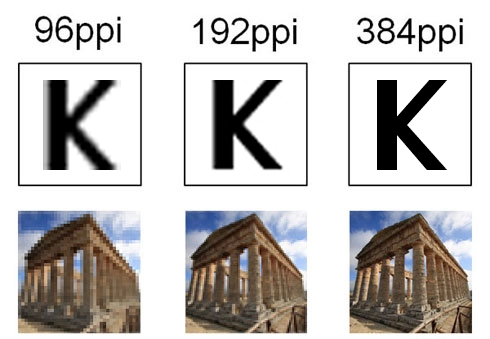
### Device Pixel Ratio (DPR)
Most products have a pixel density of 96 PPI, which gives: $\text{1 CSS Pixel} = \frac{1}{96} inch = \text{1 Physical Pixel}$
But as mobile devices evolved, high-pixel-density displays appeared, and a device's physical pixels no longer matched CSS pixels. The iPad Pro 12.9-inch mentioned above is one example: its $devicePixelRatio$ is $ 264 / 96 \approx 2.83$
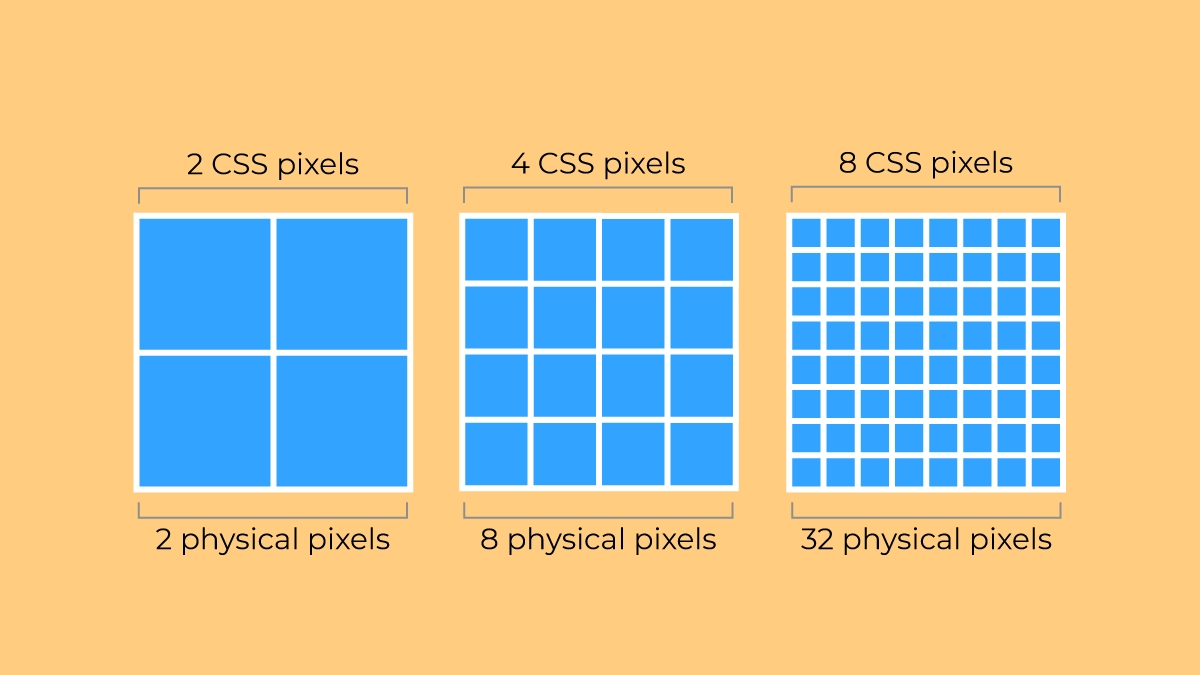
Hence the concept of **devicePixelRatio**, which links a device's physical pixels to CSS pixels, so when setting pixel values in CSS you no longer have to worry about device differences.
[Device Pixel Ratio - Oxyplug](https://www.oxyplug.com/optimization/device-pixel-ratio/#what-is-devicepixelratio) lists the DPR of common devices:
| Name | Phys. width and height | CSS width and height | Pixel ratio |
| ---------------------------- | ---------------------- | -------------------- | ----------- |
| Apple iPhone 16 Pro Max | 440 x 956 | 1320 x 2868 | 3 |
| Apple iPhone 7, iPhone 8 | 750×1334 | 375×667 | 2 |
| Apple iPhone 6+, 6S+, 7+, 8+ | 1080×1920 | 414×736 | 3 |
| Apple iPod Touch | 640×1136 | 320×568 | 2 |
| Samsung S24 | 1080 x 2340 | 360 x 780 | 3 |
| Samsung Galaxy S8+ | 1440×2960 | 360×740 | 4 |
| Samsung Galaxy S7, S7 edge | 1440×2560 | 360×640 | 4 |
| Motorola Nexus 6 | 1440×2560 | 412×690 | 3.5 |
| Sony Xperia Z3 | 1080×1920 | 360×598 | 3 |
| Xiaomi Redmi Note 8T | 1080×2340 | 393×775 | 2.75 |
| Xiaomi Redmi Note 5, 6 | 1080×2160 | 393×739 | 2.75 |
| Blackberry Leap | 720×1280 | 390×695 | 2 |
You can print `window.devicePixelRatio` in the DevTools console to check your device's DPR:
Your device's pixel ratio is:
## Responsive Image
### Rendered Size & Intrinsic Size
In DevTools you can see two important sizes for an image: Rendered Size and Intrinsic Size
- Rendered Size: the size the image displays at, in CSS px. For example, `879x500` means the image renders 879 CSS px wide and 500 CSS px tall in the browser
- Intrinsic Size: the pixel dimensions of the image file itself, in image pixels. For example, `2048x1000` means the image is 2048 pixels wide and 1000 pixels tall.
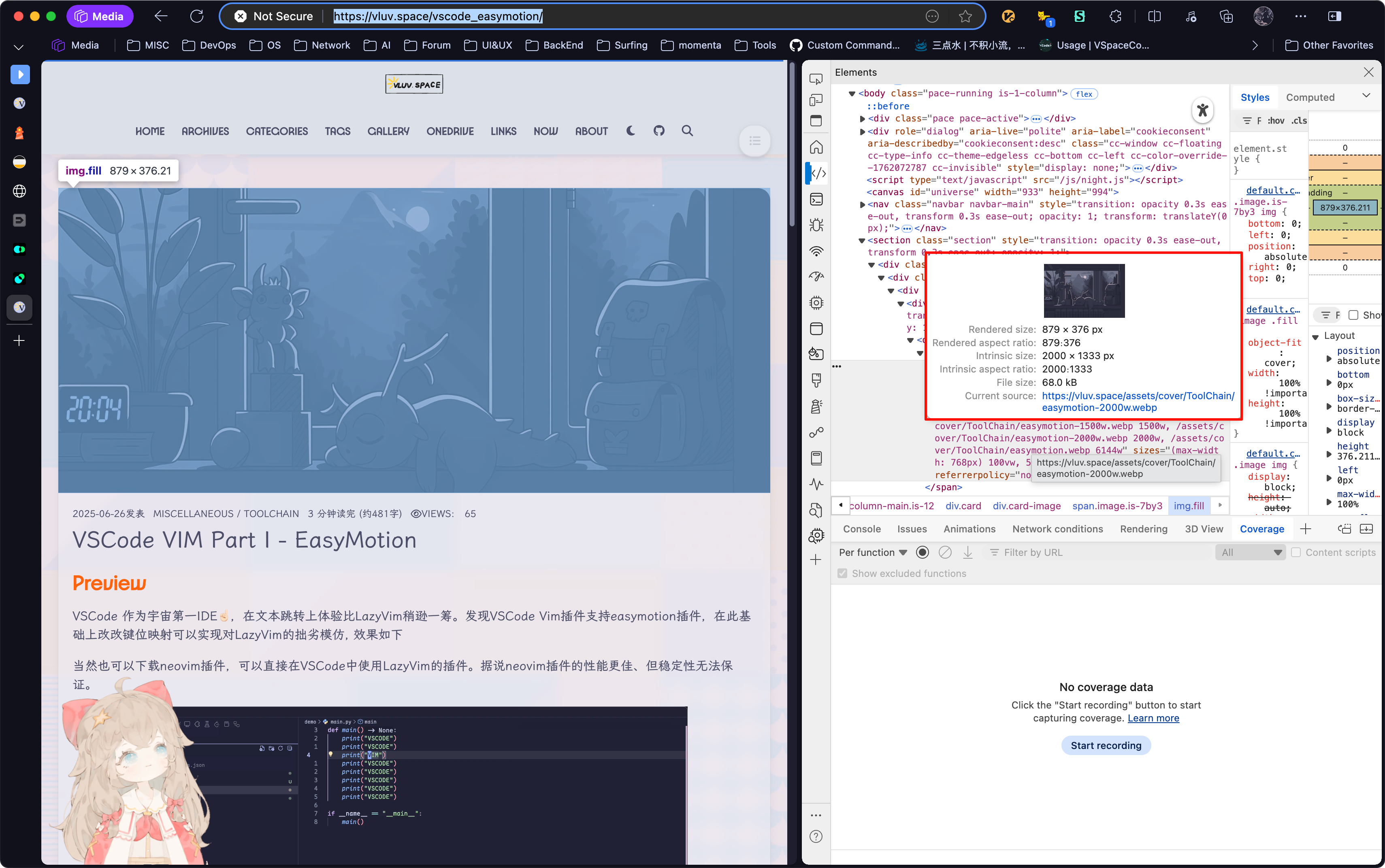
Ideally, you want $\text{Render Size} \times DPR \approx \text{Intrinsic Size}$
- $\text{Rendered Size} \times DPR \gt \text{Intrinsic Size}$
- Wastes bandwidth and hurts performance
- $\text{Rendered Size} \times DPR \lt \text{Intrinsic Size}$
- The image resolution is too low, which can cause blurring or distortion
> [!tip]
>
> For Hexo blogs, see [[lcp_optmization#Server Responsive Images]] to avoid wasting bandwidth and hurting performance.
### Srcset
Building on the pixel concepts above, we can use the `srcset` attribute to serve appropriately sized image resources to different devices. `srcset` lets us provide different image sources based on the device's DPR or the viewport width.
#### The `x` descriptor (DPR-based)
This one is simple: tell the browser directly which image to use at each DPR.
```html
 ```
#### The `w` descriptor (viewport-based)
When the image width changes with the viewport (fluid layouts), use the `w` descriptor. Tell the browser the real width of each image (in image pixels), and the browser will factor in the current DPR, viewport size, and the `sizes` attribute to pick the best resource to load, giving you responsive image loading.
```html
```
#### The `w` descriptor (viewport-based)
When the image width changes with the viewport (fluid layouts), use the `w` descriptor. Tell the browser the real width of each image (in image pixels), and the browser will factor in the current DPR, viewport size, and the `sizes` attribute to pick the best resource to load, giving you responsive image loading.
```html
 ```
## Ref
- [Window: devicePixelRatio property - Web APIs | MDN](https://developer.mozilla.org/en-US/docs/Web/API/Window/devicePixelRatio)
- [Responsive Images - A Reference Guide from A to Z | ImageKit.io](https://imagekit.io/responsive-images/#chapter-5---srcset-with-sizes)
- [Responsive Images Done Right: A Guide To And srcset — Smashing Magazine](https://www.smashingmagazine.com/2014/05/responsive-images-done-right-guide-picture-srcset/)
- [HTMLImageElement: srcset property - Web APIs | MDN](https://developer.mozilla.org/en-US/docs/Web/API/HTMLImageElement/srcset)
- [Image Sizing: Intrinsic vs. Rendered Size | DebugBear](https://www.debugbear.com/docs/intrinsic-vs-rendered-size)
- [HiDPI vs. Retina Displays — Understanding Pixel Density in the 4K Era | EIZO](https://www.eizo.com.cn/global/library/basics/pixel_density_4k/index.html)
```
## Ref
- [Window: devicePixelRatio property - Web APIs | MDN](https://developer.mozilla.org/en-US/docs/Web/API/Window/devicePixelRatio)
- [Responsive Images - A Reference Guide from A to Z | ImageKit.io](https://imagekit.io/responsive-images/#chapter-5---srcset-with-sizes)
- [Responsive Images Done Right: A Guide To And srcset — Smashing Magazine](https://www.smashingmagazine.com/2014/05/responsive-images-done-right-guide-picture-srcset/)
- [HTMLImageElement: srcset property - Web APIs | MDN](https://developer.mozilla.org/en-US/docs/Web/API/HTMLImageElement/srcset)
- [Image Sizing: Intrinsic vs. Rendered Size | DebugBear](https://www.debugbear.com/docs/intrinsic-vs-rendered-size)
- [HiDPI vs. Retina Displays — Understanding Pixel Density in the 4K Era | EIZO](https://www.eizo.com.cn/global/library/basics/pixel_density_4k/index.html)