---
title: Making Web Fast —— LCP optimization
date: 2025-06-30
excerpt: 🤖 Optimize LCP with preload, fetchpriority, responsive images and srcset. Covers Sharp image processing, CI/CD automation, and preload hints for better Core Web Vitals.
tags:
- Hexo
- Icarus
- Web
- Blog
- Responsive
- Performance
- srcset
- LCP
- Browser
cover: https://assets.vluv.space/cover/FrontEnd/lcp_optmization.webp
updated: 2026-07-08 21:18:01
lang: en
i18n:
cn: /lcp_optmization
translation: 2
---
## Intro
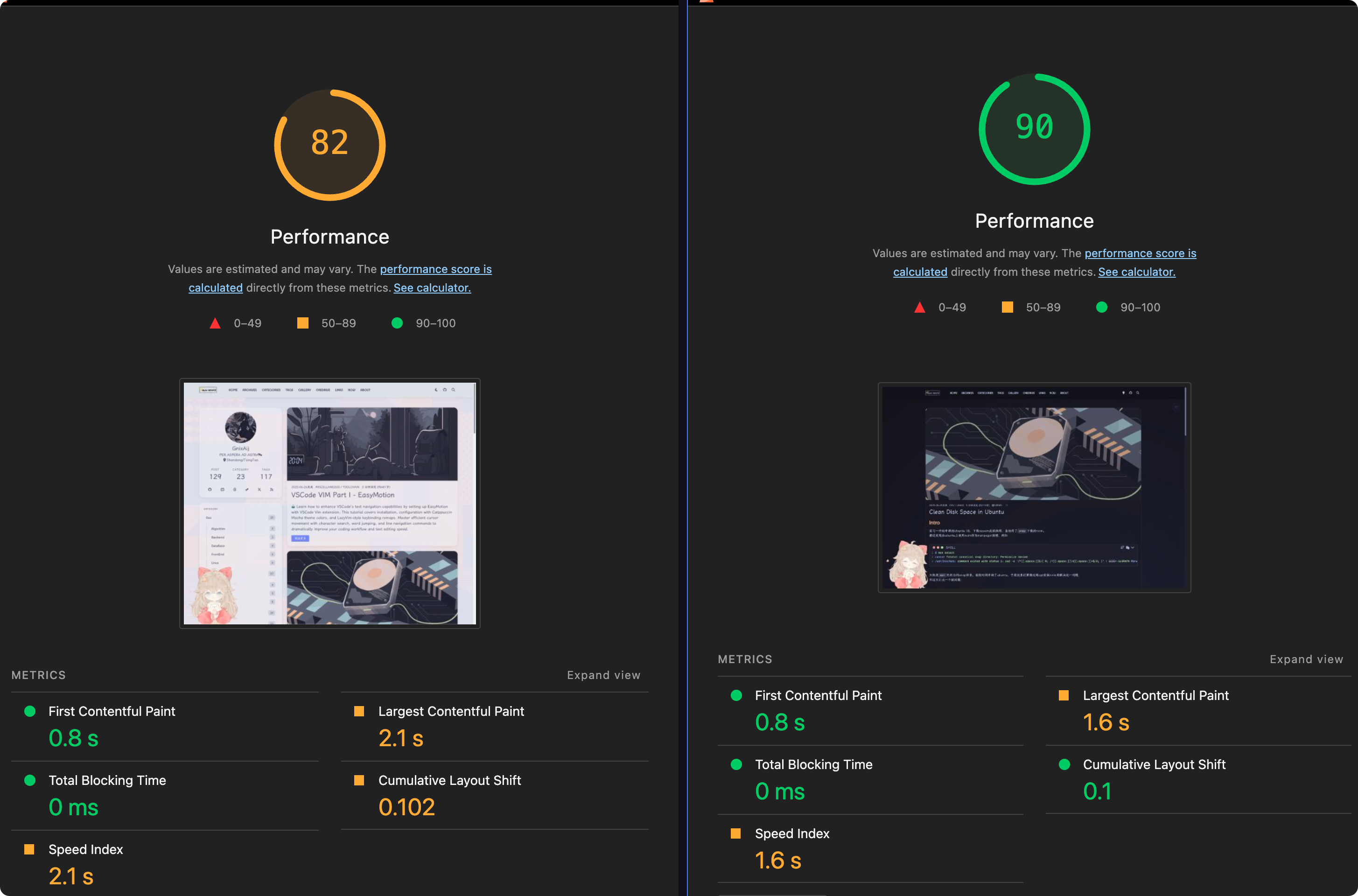
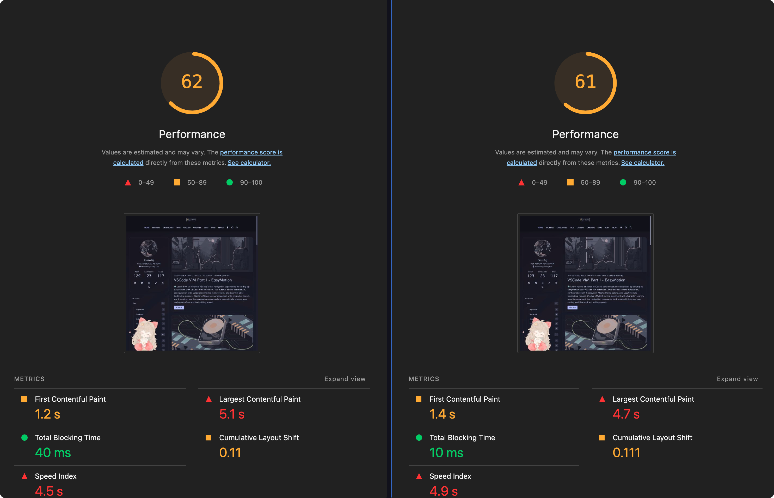
My blog embeds a fair number of high-resolution images, which hurts performance (mostly the Lighthouse score).
I found that using `srcset` for responsive images noticeably reduces the Load Time subpart of LCP.
### Dev Tools
DevTools is the panel that pops up when you press F12. Two of its tabs are especially useful for frontend optimization: Performance and Lighthouse.
Take a personal blog as an example: the page's LCP element is usually the post's cover image. When the cover is large, the LCP score drops. Generally, the ideal LCP time is within 2.5s.
### LCP
Each page's LCP can be broken down into four consecutive (contiguous in time, non-overlapping) subparts:
| LCP subpart | % of LCP | Description |
| ------------------------- | -------- | ---------------------------------------------------------------------------------------------------------------------------------------------------------------------------------------------------------------------------------- |
| Time to first byte (TTFB) | ~40% | The time from when the user initiates loading the page until the browser receives the first byte of the HTML document response. |
| Load delay | <10% | The time between TTFB and when the browser starts loading the LCP resource. If the LCP element doesn't require a resource load to render (for example, if the element is a text node rendered with a system font), this time is 0. |
| Load time | ~40% | The duration of time it takes to load the LCP resource itself. If the LCP element doesn't require a resource load to render, this time is 0. |
| Render delay | <10% | The time between when the LCP resource finishes loading and the LCP element rendering fully. |
## Load Delay
[Optimize Largest Contentful Paint | Articles | web.dev](https://web.dev/articles/optimize-lcp#1_eliminate_resource_load_delay)
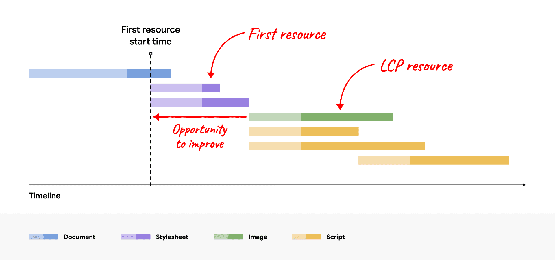
> The goal in this step is to ensure the LCP resource starts loading as early as possible. While in theory the earliest a resource could start loading is immediately after TTFB, in practice there is always some delay before browsers actually start loading resources.
In short, load delay is the "waiting period" between the end of TTFB and the moment the browser starts downloading the LCP resource (usually the hero image or a large block of text). The root cause of this delay: the browser doesn't yet **know** which resource is the critical one to prioritize, and it has to parse some HTML or CSS before it can discover it.
### 👍 Do
Put a `{html} ` tag in the HTML `` to tell the browser: "this resource (an image, or a third-party font file, e.g.) is important, start downloading it as early as possible."
### 👎 Don't
Lazy loading is a very common frontend performance technique: it defers loading resources outside the viewport to speed up initial load. But if you mistakenly apply it to the LCP element, it lengthens the "load delay" phase of LCP, which is the exact opposite of what LCP optimization is trying to achieve.
---
Example from [Optimize Largest Contentful Paint | Articles | web.dev](https://web.dev/articles/optimize-lcp#1_eliminate_resource_load_delay)
```html
```
## Load Time
> The goal of this step is to reduce the time spent transferring the bytes of the resource over the network to the user's device.
Load Time is usually proportional to the number of bytes transferred, so most advice for improving it starts with reducing bytes. You can also speed up the transfer itself, or shorten the transfer distance.
- Reduce resource size
- Efficiently Encode Images...
- Serve responsive Images...
- Font loading can be optimized too, e.g. subsetting fonts or using woff2. This post focuses on image optimization, so I won't go further into fonts here.
- Speed up the transfer
- Server bandwidth, use a CDN etc.
I won't expand on transfer speed here; things like putting a CDN in front, or splitting traffic between domestic and overseas routes, are all worth trying.
### Efficiently Encode Images
A fairly easy option: use a new-generation encoding format for images, such as `avif` or `WebP`. Google ships a CLI tool called `cwebp`, and the gowall tool I introduced in an earlier post can also convert images to `WebP`.
For day-to-day writing you can use PicList as your image upload tool, which simplifies the workflow a bit:
`collect image -> upload (PicList auto-converts to avif/WebP) -> link auto-copied to clipboard`
### Server Responsive Images
> Responsive images are a set of techniques used to load the right image based on device resolution, orientation, screen size, network connection, and page layout. The browser should not stretch the image to fit the page layout, and loading it shouldn’t result in wasted time or bandwidth. This improves user experience, as images load quickly and look crisp to the human eye.
In DevTools you can inspect an image's Rendered Size & Intrinsic Size. If they differ too much, Lighthouse may warn about [Properly size images](https://developer.chrome.com/docs/lighthouse/performance/uses-responsive-images?utm_source=lighthouse&utm_medium=devtools#how-lighthouse-calculates-oversized-images), e.g. _This image file is larger than it needs to be(6144 x 2630) for its displayed dimensions(1199x800). Use responsive images to reduce the image download size_.
For the principles and concepts behind responsive images, see [[responsive_image]]
#### Method 1. Self-Host With Sharp & CI/CD Pipeline
> [!TLDR] Optimization approach, TL;DR
>
> **Basic idea**: serve the most suitable image variant based on the user's screen size, resolution, and so on, so small-screen devices don't load oversized images.
>
> **Implementation**:
>
> 1. Modify the CI/CD pipeline so that at deploy time, tools like `sharp` automatically generate images at multiple sizes
> 2. Modify the blog theme to set the `srcset` attribute on `` and similar resources
>
> **Results**
>
> The newest post when I tested was [[vscode_easymotion]]; its hero image is a wallpaper downloaded from the catppuccin Discord. The size comparison below shows the optimization pays off nicely.
>
> | Format | Resolution | Size |
> | ----------- | ----------- | ------ |
> | png | 6144 x 4096 | 6.8MB |
> | WebP | 6144 x 4096 | 3.5MB |
> | WebP(2000w) | 2000 x 1333 | 68.0kB |
##### Step 1: Generate images at multiple sizes
Some image hosting providers can generate multiple sizes automatically, but I use Cloudflare R2 to host the images in my posts. Cover images and thumbnails for the Hexo blog live directly under the blog's `source/assets/cover` and `source/assets/thumbnails` directories. A post's YAML front matter looks like this:
```markdown
---
title: VSCode VIM Part I - EasyMotion
date: 2025-06-26
thumbnail: /assets/thumbnails/vscode_vim.webp
cover: https://assets.vluv.space/cover/ToolChain/easymotion.webp
tags: [VSCode, Vim, Catppuccin, EasyMotion]
---
Your blog post content goes here...
```
Given this layout, create a `responsive_images.js` script under `/scripts` (any other location works too) to generate the different sizes:
```javascript responsive.js
const sharp = require("sharp");
const fs = require("fs");
const path = require("path");
// NOTE replace these with the directories that hold your images
// e.g. '../source/assets/cover' and '../source/assets/thumbnails'
const imageDirs = [
path.join(__dirname, "../source/assets/cover"),
path.join(__dirname, "../source/assets/thumbnails"),
];
const widths = [128, 256, 800, 1500, 2000];
// Recursive function to find all files in a directory
async function getFiles(dir) {
const dirents = await fs.promises.readdir(dir, { withFileTypes: true });
const files = await Promise.all(
dirents.map((dirent) => {
const res = path.resolve(dir, dirent.name);
return dirent.isDirectory() ? getFiles(res) : res;
})
);
return Array.prototype.concat(...files);
}
async function processImages() {
try {
let allFiles = [];
for (const dir of imageDirs) {
if (fs.existsSync(dir)) {
console.log("Scanning for images in:", dir);
const files = await getFiles(dir);
allFiles = allFiles.concat(files);
}
}
const imageFiles = allFiles.filter(
(file) =>
/\.(jpg|jpeg|png|webp|avif)$/i.test(file) &&
!/-\d+w\.(jpg|jpeg|png|webp|avif)$/i.test(file)
);
if (imageFiles.length === 0) {
console.log("No new images to process.");
return;
}
console.log(`Found ${imageFiles.length} images to process.`);
for (const imagePath of imageFiles) {
const { dir, name, ext } = path.parse(imagePath);
for (const width of widths) {
const newFileName = `${name}-${width}w${ext}`;
const newFilePath = path.join(dir, newFileName);
if (fs.existsSync(newFilePath)) {
// console.log(`Skipping, already exists: ${newFileName}`);
continue;
}
try {
await sharp(imagePath)
.resize(width)
.toFile(newFilePath);
console.log(`✅ Generated: ${newFileName}`);
} catch (err) {
console.error(
`❌ Failed to process ${imagePath} for width ${width}:`,
err
);
}
}
}
console.log("\nImage processing complete!");
} catch (error) {
console.error("An error occurred during image processing:", error);
}
}
// Only run image processing in CI environment
if (process.env.RESPONSIVE_IMAGES === "true") {
console.log("CI environment detected. Running image processing script...");
processImages();
} else {
console.log("Local environment detected. Skipping image processing.");
}
```
##### Step 2: Set up the CI/CD Pipeline
Typically, static blog hosting pipelines let users specify the build steps themselves.
Edit the blog's `package.json` and prepend `node scripts/generate_responsive_images.js` to the `build` script, so it runs before the static pages are generated:
```json package.json
{
"name": "hexo-site",
"version": "0.0.0",
"private": true,
"scripts": {
"build": "hexo gen", // [!code --]
"build": "node scripts/generate_responsive_images.js && hexo gen", // [!code ++]
"clean": "hexo clean",
"deploy": "hexo deploy",
"server": "hexo server"
},
...
}
```
> [!tip]-
>
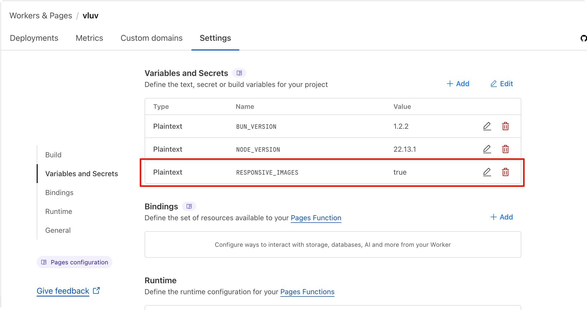
> The script reads the `RESPONSIVE_IMAGES` environment variable; if it is `true`, the image processing logic runs, otherwise it is skipped. This way the script only runs in CI/CD, not during local testing.
>
> With Cloudflare Pages, for example, you can add an environment variable `RESPONSIVE_IMAGES` in the project settings and set it to `true`
>
> 
>
> As for applying `srcset` in a theme, taking the Icarus theme I use as an example, see these two git commits of mine:
>
> - [perf(cover): improve LCP performance by using srcset attribute in img… · Efterklang/hexo-theme-icarus@ad65085](https://github.com/Efterklang/hexo-theme-icarus/commit/ad65085d6284e1009e9e41021d70ec284814cf44)
> - [perf(fix): use responsive images for cicd only Efterklang/ hexo-theme-icarus@92cb5e2 ](https://github.com/Efterklang/hexo-theme-icarus/commit/92cb5e22900d94c12749fffd5f34fd583ade4424)
#### Method 2. Using CDN Provider's API
> **CoreIX** is Bitiful's in-house, highly **automated**, **intelligent**, **highly compatible**, **high-performance** real-time **media processing engine**.
>
> Media stored in S4 object storage can access **all of CoreIX's features** simply by appending **processing parameters** to the URL (or in the GetObject API).
```html
https://demo.bitiful.com/girl.jpeg?&w=300
https://demo.bitiful.com/girl.jpeg?&fmt=avif
```
| `girl.jpeg&w?=300` | `girl.jpeg?&w=300&fmt=avif` |
| :--------------------------------------------------------------: | :------------------------------------------------------------: |
| | |
With a CDN provider's service, there is no need to process images in the CI/CD pipeline at all.
## Ref
- [Largest Contentful Paint | Lighthouse | Chrome for Developers](https://developer.chrome.com/docs/lighthouse/performance/lighthouse-largest-contentful-paint)
- [Optimize Largest Contentful Paint | Articles | web.dev](https://web.dev/articles/optimize-lcp)
- [Serve responsive images | Articles | web.dev](https://web.dev/articles/serve-responsive-images)
- [Efficiently encode images | Lighthouse | Chrome for Developers](https://developer.chrome.com/docs/lighthouse/performance/uses-optimized-images/?utm_source=lighthouse&utm_medium=lr)
- [Window: devicePixelRatio property - Web APIs | MDN](https://developer.mozilla.org/en-US/docs/Web/API/Window/devicePixelRatio)
- [Responsive Images - A Reference Guide from A to Z | ImageKit.io](https://imagekit.io/responsive-images/#chapter-5---srcset-with-sizes)
- [Responsive Images Done Right: A Guide To And srcset — Smashing Magazine](https://www.smashingmagazine.com/2014/05/responsive-images-done-right-guide-picture-srcset/)
- [HTMLImageElement: srcset property - Web APIs | MDN](https://developer.mozilla.org/en-US/docs/Web/API/HTMLImageElement/srcset)
- [CoreIX 概述 - 缤纷云文档](https://docs.bitiful.com/coreix/basic)
 |
|  |
With a CDN provider's service, there is no need to process images in the CI/CD pipeline at all.
## Ref
- [Largest Contentful Paint | Lighthouse | Chrome for Developers](https://developer.chrome.com/docs/lighthouse/performance/lighthouse-largest-contentful-paint)
- [Optimize Largest Contentful Paint | Articles | web.dev](https://web.dev/articles/optimize-lcp)
- [Serve responsive images | Articles | web.dev](https://web.dev/articles/serve-responsive-images)
- [Efficiently encode images | Lighthouse | Chrome for Developers](https://developer.chrome.com/docs/lighthouse/performance/uses-optimized-images/?utm_source=lighthouse&utm_medium=lr)
- [Window: devicePixelRatio property - Web APIs | MDN](https://developer.mozilla.org/en-US/docs/Web/API/Window/devicePixelRatio)
- [Responsive Images - A Reference Guide from A to Z | ImageKit.io](https://imagekit.io/responsive-images/#chapter-5---srcset-with-sizes)
- [Responsive Images Done Right: A Guide To And srcset — Smashing Magazine](https://www.smashingmagazine.com/2014/05/responsive-images-done-right-guide-picture-srcset/)
- [HTMLImageElement: srcset property - Web APIs | MDN](https://developer.mozilla.org/en-US/docs/Web/API/HTMLImageElement/srcset)
- [CoreIX 概述 - 缤纷云文档](https://docs.bitiful.com/coreix/basic)
|
With a CDN provider's service, there is no need to process images in the CI/CD pipeline at all.
## Ref
- [Largest Contentful Paint | Lighthouse | Chrome for Developers](https://developer.chrome.com/docs/lighthouse/performance/lighthouse-largest-contentful-paint)
- [Optimize Largest Contentful Paint | Articles | web.dev](https://web.dev/articles/optimize-lcp)
- [Serve responsive images | Articles | web.dev](https://web.dev/articles/serve-responsive-images)
- [Efficiently encode images | Lighthouse | Chrome for Developers](https://developer.chrome.com/docs/lighthouse/performance/uses-optimized-images/?utm_source=lighthouse&utm_medium=lr)
- [Window: devicePixelRatio property - Web APIs | MDN](https://developer.mozilla.org/en-US/docs/Web/API/Window/devicePixelRatio)
- [Responsive Images - A Reference Guide from A to Z | ImageKit.io](https://imagekit.io/responsive-images/#chapter-5---srcset-with-sizes)
- [Responsive Images Done Right: A Guide To And srcset — Smashing Magazine](https://www.smashingmagazine.com/2014/05/responsive-images-done-right-guide-picture-srcset/)
- [HTMLImageElement: srcset property - Web APIs | MDN](https://developer.mozilla.org/en-US/docs/Web/API/HTMLImageElement/srcset)
- [CoreIX 概述 - 缤纷云文档](https://docs.bitiful.com/coreix/basic)